
i bought a box of archives. it's usually a fun rip, but it is getting a bit fatiguing to see some designs recycled again. i won't go on a 1978 rant, but....
still, i enjoyed the box i obtained - even moreso than the one i picked up last year. here are the dodgers i found:
clayton kershaw

dustin may
 i find it interesting that topps has never, to my knowledge, released a sticker set based on the 1962 design, since the whole design is based on a sticker or poster that is peeling off of a fence.

will smith
 a look at next year's heritage here with the 1973 design.

duke snider
 kudos to topps for matching the city affiliation in the two photos on this 1983 design.

i didn't get a jackie robinson card, which is the only dodger to be featured on the 1991 design (just like he was in 2016 archives). it was a huge miss on topps' part to not have jackie featured on a 1957 design for the first time ever rather than do what they did just five years ago.
roy campanella
 campy is the only dodger to be featured on the 2001 design, and it looks pretty good

pee wee reese
 i had good luck with the brooklyn dodgers in the set outside of jackie robinson. however, we've seen pee wee on the 2011 design before as a veteran legend variation 10 years ago.

don drysdale
 this is the 2091 topps design, which i initially thought was an insert. i could see this as a topps finest design now. i also found my first trea turner dodger cards - base and green parallel!
 green cards are numbered to 125

on to some of the non-dodgers....


i feel like i have more cards numbered 42/xxx than any other number but that could be just because i notice that number when i see it.
ketel marte was the first card in the first pack
 repping the 1957 design. here's the back:
 which looks pretty true to the original.


some other 1957 design cards that caught my eye are these four


 again, the back looks pretty good. some other 1962 cards that caught my eye:
 ke'bryan hayes is going full brady bunch on the rookie card logo, and i think the joe morgan card (outside of the elastic band uniform pants) could pass for a 1962 card. of course, the yankee stadium facade (even if it might be their spring training home) always looks appropriate on cards from the 1960's.

i especially think the reggie jackson card would fit perfectly in the original 1957 set. the jim thome card lays to rest any question we would have about topps avoiding the use of chief wahoo on cards now that he's been retired, especially given that topps had airbrushed that logo out of cards in sets in recent years.
here's ryne sandberg's card
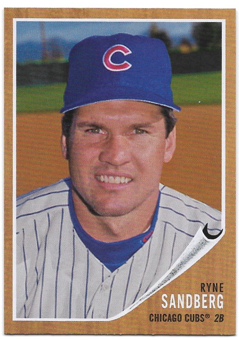
which is a pretty solid 1962-esque card. here's the back of may's card:


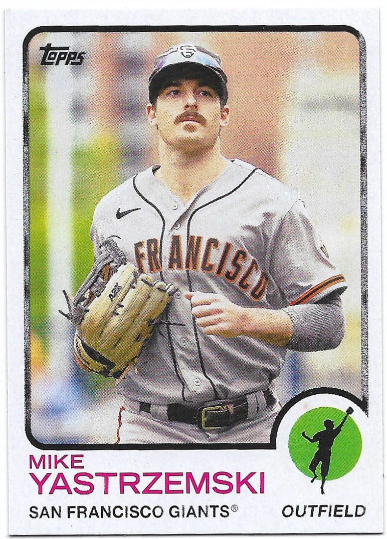
on to 1973 with mike yastrzemski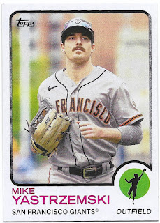 with the back explaining his mustache
 i think the back looks pretty good except for the text above the stats.

here are some other 1973 designs:
 i was hoping for some odd photos as i was looking for a preview of next year's heritage. these four seem like they could be 1973 cards, with casey mize out in a park, jacobe degrom in the minor league facility and eric hosmer up in the stands for some reason. i thought the ohtani was interesting as topps created a designated hitter logo for the card but listed ohtani as both a dh and pitcher. i then found out that there is a pitcher logo variation out there, too.

here are some 1983 topps designs:
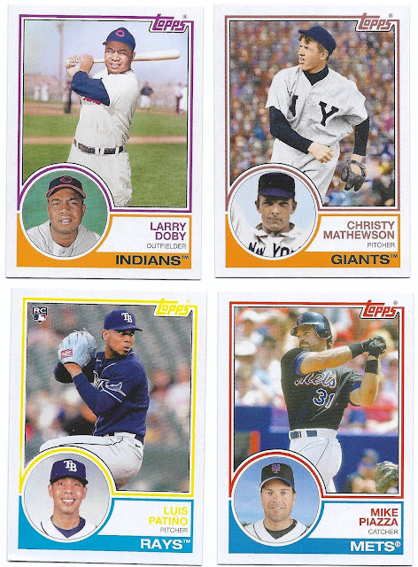 cleveland kept chief wahoo off of their hats until 1954, so there are plenty of larry doby images without it. the christy mathewson card is interesting to me because the colorized fans in the background give the card an impressionistic quality. the luis patino card was scanned because the yellow topps used is very bright and makes the name hard to read - the card looks much better scanned. finally, the mike piazza card looks pretty solid as far as a 1983 card is concerned, although it (like the others here) is cropped a bit too closely. plus, we just saw piazza on this design three years ago.

here's the back of patino's card:
 not sure why topps avoided past tense in the text under the stats there as that is not consistent with 1983.

1991 design cards were lacking some of the multi-player action shots (think carlton fisk and walt weiss) that made that set so fantastic, but i thought these cards looked good:
 the city name has been added to the design (except for angels cards), but topps did a good job with the photos breaking the top border like most of the cards did in 1991. here's the back of mike trout's card:
 i didn't get any cards with the "monthly scoreboard" that adorned some 1991 topps card backs - not sure if there are any of those in the set or not.


on to 2001, here's hank aaron's card:
 aaron was featured in the 2001 topps set, but his card was a golden moment subset card, so it's nice to see a regular card for him. here are some others:
 the dave winfield card is great, but the vida blue card might be my favorite base card of the whole box. will clark, like aaron, was featured in the 2001 set, but he was a cardinal back then. here's the back of yadier molina's card:
 the back is pretty much spot on. i wonder when topps converted to a digital design of their cards that would make it easier to retrieve the card design. i would guess some time in the late 1990's?


here are some cards with the 2011 design:
 as a whole, this subset might be my favorite of this year's archives. it's been 10 years since this set was released, but i think the design holds up. these cards, especially the puckett (which would compete against the vida blue card above for my favorite base card from the set), look really nice, although the foil seems more gold than silver. there should be more cards with the yellow comiskey park railing in the background, as both the puckett and don mattingly cards can attest.

here's the back of david fletcher's card:
 this card goes in my tatooine collection, by the way, and is very similar to another card i have in that collection of freddy sanchez.

finally, the 2091 subset
 here's the card back:
 i sort of expected these backs to be full of the analytical stats, but no. here are some others that i scanned:

 (how long has topps been putting the accent in montreal?) and this mini poster insert card
 looks like the kids are channeling their dead fathers in this coming of age story, except none of the dads are dead.


like larry doby, bob feller was around before chief wahoo made the hats, so plenty of photos for topps to use on cards.
ted williams is featured in this design, too

i can't not scan a ted williams card.
i didn't see any dodger stadium cards (maybe the will clark card above) or double play cards, but i did add a couple of cards to my vladimir guerrero collection with his base card


my box topper was the astros' mini poster

seems like it's missing lance berkman? and was derek bell considered a killer b? actually, operation shutdown is a movie i would watch.
i found three more mini poster cards in the packs

i'm not sure what sort of movie "the big three" would be (i think the a's have similar card in this set), but clearly "the big red machine" is an action film like "the magnificent seven" or "the expendables" (too bad topps couldn't sneak pete rose on to the card somehow), and "murderer's row" is a good cop/bad cop thriller, no doubt.
here are the odds for a hobby box, by the way.


topps took their 1989 topps big design and made it miniature, which is clever. i found bryce harper's card in my box:

another recycled design is the 1994 draft pick subset. i pulled joey bart's card
 it's bart's time to shine in san fran with posey retiring. hopefully he lives up to the hype just enough to get the giants to second place in the nl west.

my two promised autograph cards are better than last year's - ken griffey on a 2002 topps design
 and greg luzinski on a 1960 design
 purple parallel, yo!
 i really was hoping for dusty baker and dave roberts, but will have to track those down another way.


here's another card for my mini-collections - it's babe ruth on the 2011 topps design:
 this card will replace the sticker that i had in my memorials collection for the ray chapman armband the yankees and other teams wore in 1920. you can see the armband on ruth's left sleeve. i am glad to have a full-size card in the collection rather than the sticker.

like i said up top - this is a fun break for me, and i enjoyed the box i opened this year. i have some extras, so let me know if you are looking for specific players.
Love that Aaron Judge! The Griffey sr. is nice too.
ReplyDeletei agree on both counts!
DeleteGriffey Sr as a Yankee, oof. That's disappointing (if I was opening it).
ReplyDeleteThe 2011 design cards with the retired players on it remind me of the legends SPs in that set.
without the dirty balls though!
DeleteTopps is really trying to get their money's worth with the '83 design. I've lost count of how many times I've seen it used these last few years. I ordered most of the Archives base I needed off Sportlots, and I'm particularly interested to see the cards that use the 2011 design. Definitely weird to think those cards are already a decade old.
ReplyDeletewould be curious to know your take when you get your sportlots order.
DeleteThat Ken Griffey is all kinds of awesome! I don't know if it would considered a great "pull" or not, but I sure wouldn't have been disappointed with it had I bought the box. Great breakdown on the box too. I couldn't spend this much on a box, but with a post that's this thorough, I can certainly get a good feel for what one might be like to open.
ReplyDeletei was pleased with the griffey for sure. i have another signed card of him as a yankee in the collection, but am keeping an eye out for a red card, too.
DeleteLove the on-card autographs... and the decision by Topps to use one design from each of the first 7 decades. I'd like to find a complete set on eBay, but right now the price is not even close to what I'm willing to pay.
ReplyDeletemy box yielded maybe half a set? i can understand why complete sets have a high-ish price tag.
DeleteThis is a great post - love it when someone shows off what a newest looks like in the wild. I just ordered some singles from this set based on your post.
ReplyDeletethanks jay. hope to see which singles you chose for your collection.
Delete