
i enjoy abstract expressionism as an art form. it's not all i like, but i have prints of works by klee, kandinsky, pollock, and rothko in the house. i don't care too much for artwork that is a literal representation of things, although i can appreciate a nice portrait or landscape.
you can probably guess that i wasn't a big fan of the art cards that upper deck included in their early sets on the team checklists (no offense, vernon wells!), and even the diamond king cards that i first saw in 1982 were not as interesting to me as cards with actual photos.
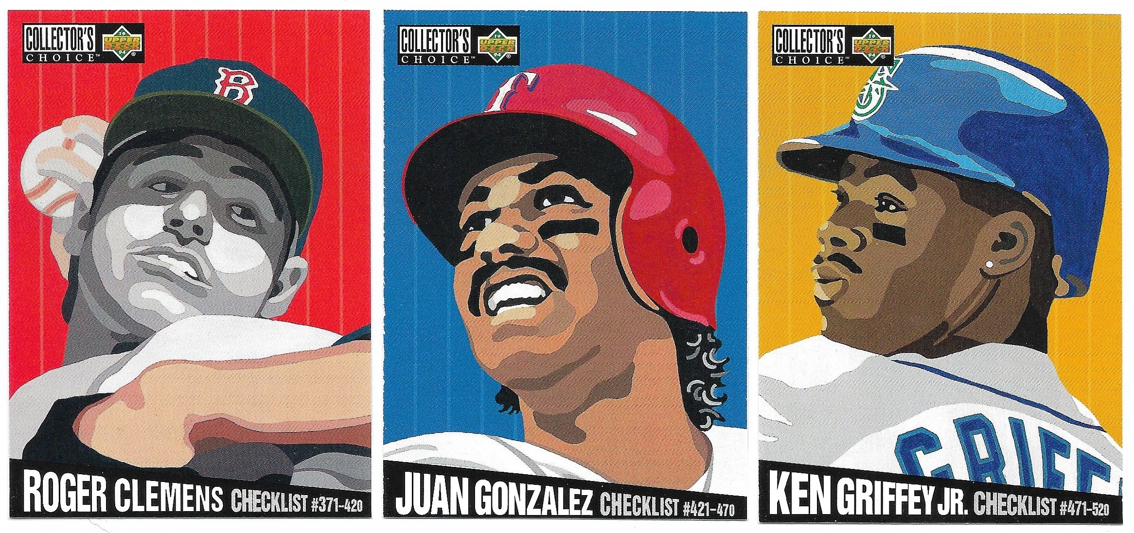
then, in 1994, i was pleasantly surprised by the bold and colorful checklists upper deck included in their collector's choice release. i was recently going through some old player collections and saw mike piazza's card for the first time in awhile.

i found a few more of these checklist cards as i continued to rifle through the boxes, and i decided that i would binder up all the cards as a complete subset. of course, when i went to find a nolan ryan card, all i had was the silver signature parallel it turned out i was missing a couple others, so i put in a sportlots order and now i have the complete subset all together in a binder with other subsets.


 that's a pretty good representation of the majors in 1993, although greg maddux probably deserved to be included. can't go wrong with two griffeys though. or a john kruk art piece, for that matter. out of all of these, david justice's card might be my favorite. i am glad i was looking at those piazza dupes and was reminded of this 30 year old set! zoinks!


I'd never seen those before - very striking.
ReplyDeleteThe only ones of these I've seen are the ones on the top row. I've never liked these much, but they look better all together like that.
ReplyDeleteThis has never been my preferred art style, but I do like the Kruk.
ReplyDeleteI wonder why some faces are in color while others are in black and white...
ReplyDeleteNever really cared much for these as individuals... but when you put these all together in one post, they look pretty cool.
ReplyDelete