
i've added a few steve garvey autograph cards to the collection in recent months, including this one:


plus this guy:

and this one, too:

despite appearances, all four of those cards are produced by topps - not panini. the top two are from 2022 topps diamond icons (the top one is the "base" silver ink autograph and the second is the "black" silver ink parallel) and the bottom two are from 2022 topps tier one (the first being the "base" and the second being the "bronze ink" parallel).
aside from the oddity of all four cards featuring different pens used to sign (not sure why he didn't use the same pen for both "silver ink" cards), i was struck by the photo topps settled on. if not for the correctly shown red number, these could easily be panini cards since garvey's famous forearms are covering up the dodger uniform script and the logo on the helmet is indiscernible and could be easily wiped.
these cards remind me of 2008 donruss threads and the garvey card in that release that garnered a post at the long gone original wax heaven site referring to it as the worst example of donruss' logo wiping. this opinion shared by mario was largely due to the "glare" that was added to the helmet to obscure the interlocking la logo. anyway, these are hard signed topps cards, and i am happy to have them.
i do think it's odd the way topps has named the tier one card - here's the back:
 so it's a 2022 topps tier one tier one talent autograph. similar to some autographs from finest which are topps finest finest moment autographs.

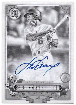
of course, topps also used this same photograph for their 2022 gypsy queen release, and i have most of those cards now. here's the base auto


the "missing nameplate" parallel auto

the "indigo" parallel auto:

the "blue" parallel auto:

and the "black & white" parallel auto:

i don't have the "missing blackplate" or "black" autos, the latter of which is a 1/1.
topps officially calls these "gq autographs" on the back

but then again, they abbreviate gypsy queen to "gq" as well. i just call these 2022 topps gypsy queen autographs rather than 2022 topps gypsy queen qq autographs or 2022 topps gypsy queen gypsy queen autographs.
garvey's other cards in gypsy queen this year feature a different photo with the helmet logo and uniform script more visible:

it actually gives off a more 2010 upper deck vibe. here's the back:

it's not actually a booklet - it's just made to look that way. it is a 1/1, however. and, topps calls this a "autograph garment card" and not a "gq autograph garment card". whatever.
here's the other version of that card, numbered to 50:

no patch with the "common" version.
i figured i would show another card that i added to the collection a few months ago that fits the theme of this post. this is a 2008 donruss playoff prime cuts century gold parallel

numbered to 5. you can see what things looked like in the early days of no logos from donruss/panini, with the same glare on garvey's helmet that was used on his aforementioned threads card that same year. i would say we've come a long way but that would imply improvement. in a perfect world, topps would be choosing photos that celebrate the team logos as that has been the great differentiator between them and the competition but that just wasn't the case with these garvey cards this year.
As far as the two different sets with the same photo go, it looks pretty good with the GQ design. And that 1/1 design sure is neat too. That's easily the best looking thing that I've ever seen from a GQ set.
ReplyDeleteA. Wowza. Your Garvey autograph collection is awesome.
ReplyDeleteB. It would have been cooler had Topps chose a better photo for the Diamond Icons, Tier One and GQ cards. At the very least they could have put a Dodgers logo somewhere on the front of the card if the logo on the jersey is covered up. Gotta rub it into Panini that they have a license :D