
there is no jessie, but as far as chrome goes, every "time" it is released, i am resigned to purchasing a box or some packs because "i think i want to know ya". that was the case this year, although i was once again reminded that there is not much new there. i like the refractors fine, but it gets repetitive. anyway, before i show some 2023 stuff i realized that i didn't say much about 2022 topps chrome last year (which probably says all you need to know), but i scanned a bunch of the cards and "i need to show ya" so "check it out".
i'll start off with some of the non-parallel inserts, like this mookie betts "pinstriped" card

i have no idea why this insert set is call "pinstriped". the dodgers, of course, do not have a pinstriped uniform.
max muncy "heart of the city"

trea turner "new classics"
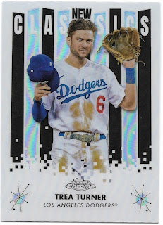 the back of the card compares turner to hall of famer tim raines, who i guess would then be considered an "old classic", or i suppose just "classic"

here's turner's base card
 which is his base and not the chrome sonic base, even thought the topps chrome logo is on the left.

as i mentioned, i still go for refractors, so here are some base refractors - andre jackson

 plus muncy paired with his sepia refractor
 i have sepia refractors of clayton kershaw
 and julio urias


 and the xfractor of kershaw
 there are, of course, way more refractor parallels out there, including a large number of numbered parallels.

and justin turner


as well.
pink refractors are still provided in retail stuff (blasters, i think), and here's justin turner's

and kershaw's

here's a prism refractor of mookie betts


chrome update is also still a thing, with their exclusive purple refractors like freddie freeman's here
 and this nice josh rojas double play turn here
another chrome set issued the last couple of years has been chrome black. i have a couple base cards that i've picked up, but mostly what i've added from these releases are more steve garvey autograph cards. here are the ones from 2022 that i've picked up


and then there are the extra chrome sets, like chrome sapphire edition
 which is a true parallel set to flagship - series 1, 2, and update. i only have a few, including will smith's card, which features a whole lot of blue!

"base"


green refractor /99


refractor /199


gold refractor /50

the "wormhole" background shows up pretty well on the refractors. i always wonder about chrome cards that don't look very appealing in their non-refractor format - like what is the point?
aside from chome sonic (and, i suppose, chrome ben baller) perhaps the most useless chrome release in 2022 was "logofractor". i found a kershaw card cheap

i think the seller got it confused with an xfractor. topps is just a step away from the panini-esque emoji parallels. in fact, i wonder if this is them flaunting their license in panini's face.
as for 2023 topps chrome, here's kershaw's base card


Never seen the Heart of the City or Logofractors before. I really like city related cards... so I had to see if Oakland had a card in the Heart of the City set. They do... but it doesn't nearly look as cool... because Topps picked the size of the font based on the length of the name of the city. Los Angeles is reasonably sized on the Muncy insert... but they made Oakland way too big on the Matt Olson card.
ReplyDeleteAs for the Logofractor... I think it looks really cool. But the last thing I want is for Topps to start making 50 different parallels like Panini.
Maybe the New Classic insert should have been named Pinstripes with that background!
ReplyDeleteNice stuff. Since Topps increased the prices of blasters I find it difficult to sample some unlike previous years.
ReplyDelete