Wednesday, November 16, 2022

is that you, panini?

i've added a few steve garvey autograph cards to the collection in recent months, including this one:
as well as this one:
plus this guy:
and this one, too:
i'll pause there.

despite appearances, all four of those cards are produced by topps - not panini. the top two are from 2022 topps diamond icons (the top one is the "base" silver ink autograph and the second is the "black" silver ink parallel) and the bottom two are from 2022 topps tier one (the first being the "base" and the second being the "bronze ink" parallel).

aside from the oddity of all four cards featuring different pens used to sign (not sure why he didn't use the same pen for both "silver ink" cards), i was struck by the photo topps settled on. if not for the correctly shown red number, these could easily be panini cards since garvey's famous forearms are covering up the dodger uniform script and the logo on the helmet is indiscernible and could be easily wiped. 

these cards remind me of 2008 donruss threads and the garvey card in that release that garnered a post at the long gone original wax heaven site referring to it as the worst example of donruss' logo wiping. this opinion shared by mario was largely due to the "glare" that was added to the helmet to obscure the interlocking la logo. anyway, these are hard signed topps cards, and i am happy to have them.

i do think it's odd the way topps has named the tier one card - here's the back:
so it's a 2022 topps tier one tier one talent autograph. similar to some autographs from finest which are topps finest finest moment autographs. 

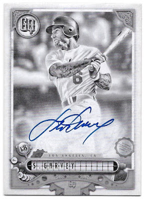
of course, topps also used this same photograph for their 2022 gypsy queen release, and i have most of those cards now.  here's the base auto
the "missing nameplate" parallel auto
the "indigo" parallel auto:
the "blue" parallel auto:
and the "black & white" parallel auto:
i don't have the "missing blackplate" or "black" autos, the latter of which is a 1/1.

topps officially calls these "gq autographs" on the back
but then again, they abbreviate gypsy queen to "gq" as well. i just call these 2022 topps gypsy queen autographs rather than 2022 topps gypsy queen qq autographs or 2022 topps gypsy queen gypsy queen autographs.

garvey's other cards in gypsy queen this year feature a different photo with the helmet logo and uniform script more visible:
it actually gives off a more 2010 upper deck vibe. here's the back:
it's not actually a booklet - it's just made to look that way. it is a 1/1, however. and, topps calls this a "autograph garment card" and not a "gq autograph garment card". whatever.

here's the other version of that card, numbered to 50:
no patch with the "common" version.

i figured i would show another card that i added to the collection a few months ago that fits the theme of this post. this is a 2008 donruss playoff prime cuts century gold parallel
numbered to 5. you can see what things looked like in the early days of no logos from donruss/panini, with the same glare on garvey's helmet that was used on his aforementioned threads card that same year.  i would say we've come a long way but that would imply improvement. in a perfect world, topps would be choosing photos that celebrate the team logos as that has been the great differentiator between them and the competition but that just wasn't the case with these garvey cards this year. 

Wednesday, November 9, 2022

the last of the 57s - a countdown

i am happy to say and pleased to report that i completed my 1957 topps set last month!
that's the image that goes on the set binder's spine.

it took a while - i first pondered going after the set in 2011, and decided to go all in on the set back in early 2015 as i recall. i was down to a couple dozen cards earlier this year and so decided to finish before the clock struck 2023. and so i did!

to celebrate, i'll rank the last 15 cards that i needed using no real criteria other than how i am feeling now as i write the post. here we go....

15. cleveland indians team card
team cards in this set are pretty blurry across the board. even though this one features bob feller in his only appearance in the set, the team's logo ensures it as the worst of the last 15 cards i needed. sorry not sorry wahoo.

14. white sox team
again, a blurry team card is tough to get too excited about, although this one does have me wondering why some players cast shadows and others don't, and whether or not minnie minoso really was in the very back behind larry doby or if he was added to the image later.

13. billy o'dell
some leading man looks with his faraway eyes, but the shading of the background has me scratching my head. are there "pink tint" variations in 1957 topps? i like the ornithologically correct logo on the hat, though.

12. bobby richardson
well, i was right. the richardson was the last card i needed for the set, and the most expensive of these final fifteen. however, the youngster posing in front of an industrial/medical complex instead of inside the house that ruth built leaves me disappointed with this card.

11. chico fernandez
at least chico is inside a stadium, however, the crop on the shot is a bit too tight for me on this card. what really dooms the card in my opinion is the drab sky that blends with his away jersey. 

10. mickey mcdermott
not the mickey m. card you wanted to pull back in '57, that's for sure. the portrait shot with the dark background is antithetical to the best cards in the set that show more of the player and some sweet stadium backgrounds. however, the bright colors of the card text make this one stand out.

9. ned garver
ned's jersey and the sky behind him are the same color, but unlike chico above, ned's image includes a pose that fills out the frame a bit better and some other colors to help out. the card text gets a bit washed out, but i appreciate seeing some of the team name on his jersey.

8. harvey haddix
poor harvey here is looking fairly optimistic. little does he realize that in a couple of years he will throw 12.2 perfect innings in a game and lose to a guy who gave up 12 hits. i like the color on this card - a nice red phillies hat - but the background is too washed out. maybe if topps had used the infield stands as a background instead of the ebbets field outfield, this tight crop would have ranked higher. also, different colors for the card text, such as a color scheme like his teammate's above would have worked, i think.

7. rene valdes
lots of color here, and a pose similar to garver's above. the colors are better, though. i assume this was a spring training shot (the text on the back is about valdes' performance in spring training prior to the 1957 season), but i don't know if topps went to florida back then. i don't know of any trees around ebbets field, but maybe the photographer found a spot for valdes to pose. if that's not a tree behind him, i don't know what it is.

6. billy goodman
this is a decent example of what i like in the '57 set, although it doesn't have the strongest background. the distinct colors of the photo and card text help the card on this countdown for sure.

5. jackie collum
here we have collum posing in ebbets field. having the colorful mennen and michaels & co signs in left field behind him are a plus for the card. however, the grass isn't too green, and his teammate has been decapitated by the crop. plus, this card suffers from the slanted horizon.

4. andy carey
a yankee at the bat rack is a pretty solid performer on this countdown. i think this is one of the better yankee cards in the entire set even though the background is monotone.

3. sam jones
mr. jones is standing with the ebbets field stands behind him, and the color of the upper deck works nicely as an accent. the card text is in contrast to the colors of his uniform, and we get a good look at the old "cardinals" script.  the only improvement i would have made here was to reduce the crop so as to get his glove in the frame, but perhaps then the card text wouldn't "pop" as much.

2. darrell johnson
this is great. the future mariners manager is shown crouching in ebbets field with the right center field backdrop. i recognize the van heusen shirts sign (it's red) and the bulova timepieces sign to its right. the photo was likely taken on the day of the cross-town mayor's trophy game that used to occur in new york. in 1957, the game was played on may 23 between the yankees and dodgers in brooklyn. there was no game in 1956, and johnson wasn't on the yankee roster for the 1956 world series. i suppose he could have been there in a non-roster role, but i like the idea of this photo being taken prior to the in-season exhibition game. 

1. wes covington
what a gorgeous card. there is so much color here that i apologize for ever thinking that this set was unattractive. back in 2006, it seemed like heritage purposely washed out the colors and at that time, i didn't have too many real 1957 cards in my collection. once i started adding dodger cards from the set in earnest, i realized just how colorful the set is. anyway, we have covington in ebbets field, with the outfield billboards in all their glory behind him. the only negative here is that the sky isn't blue. we have green grass, brown dirt, white chalk, all the colors of the signage, and covington's braves uniform with the accent piping. it's a great looking card - one of my favorites in the set, not just of these last fifteen that i needed for completion.

so, my 1957 topps set is complete. that means i have completed the topps flagship sets from 1957, 1965, and 1970-2010. i don't really have plans to chase another one, but never say never.

Sunday, November 6, 2022

an update at the end of the season

well, congratulations to old friend dusty baker for adding a world series championship to his managerial resume. i am very happy for him!

with the astros' win, the 2022 baseball season comes to an end, but there are still a number of key baseball card releases (stadium club and allen & ginter to name a couple) coming up. one of the more recent issues was the annual update series that i have been looking forward to quite some time. the main reason for this is that the 2022 all-star game was held at dodger stadium and i was looking forward to some great looking cards as a result. i wasn't disappointed, although i will hold off on showing those cards for the time being.

when i looked at the checklist a week or so before my box arrived, i saw that clayton kershaw had a highlights card in the set. i was really hoping that the event that the card was focused on was his 7 perfect innings performance in minnesota back in april. that was not the case.
instead, the card celebrates his passing don sutton on the dodgers' all-time strikeout leaderboard. that's a big deal for dodger fans like myself who grew up with sutton as the ace of the staff. i do take some consolation in that this card uses a photo from kershaw's start against the twins, so i will for sure put a duplicate in my "cards featuring games i've attended in person" mini-collection.

similarly, these three twins cards
feature photos from the two games i went to that pitted the twins against the dodgers. i was hoping for a josh winder rookie debut card, since that occurred on april 12 against the dodgers, but topps used a photo from that game on his regular rookie card. chris archer was the twins' starter on april 12 and chirs paddack took the bump against kershaw on the 13th.

those three cards are what update is all about - veterans on new teams and a rookie who spent most of the season with a team. for the dodgers, it was nice to get a card of tyler anderson
even as i was surprised to not see trayce thompson included on the checklist. i guess his double dipper post will have to wait.  here are more of the dodger base cards
guys like dustin may and tony gonsolin have no business being in update. but, with the number of rookies topps puts in series 1 and 2, there isn't any room for the back end of the rotation guys.

combo cards are included, as always, and new dodger freddie freeman makes an appearance on one
as to the angels' mvp duo of shohei ohtani and mike trout
i feel like this has been an annual thing to see these two guys on a card in update since 2018

i showed freddie freeman's base dodger card up above, and i was quick to pick up two of his photo variation card
thanks to the dodger stadium background.  i also sought out his 1987 insert
because it wasn't one of the six in my box. instead, these were the ones that i found:
i am keeping a few base cards for myself, including this tyler mahle card
that shows him pitching in dodger stadium. in a perfect world, mahle would have been in this set as a twin since that's who he pitched for after the trade deadline. i guess the deadline for topps is right after the all-star game for this set.

i found a couple of double play cards, too
and, of course, the bigger name rookies
there were some interesting cards that i've paired up, like these two albert pujols cards:
that base card would have made a fine final tribute card in next year's flagship. i would be shocked if he were not a part of series 1, but stranger things have happened.

here are a couple of checklist/highlight cards in the same vein as the kershaw card up top
100 home runs for these guys.

i found two rainbow foil parallels
and two gold parallels
but no gold foil parallels.

i did get an orange foil parallel
and an independence day parallel 
looks like i got kerry's box.

here are the two black gold inserts i found
and here are the two diamond great die-cuts from my box
i only found one paragons of the postseason insert
there are no dodgers on the checklist for this insert set, although i see a dodger foot in the background behind arozarena.

here's the one generation now insert i found
roansy turns 23 tomorrow

i was promised one hit in the box, and this was it
i had been hoping for an all-star stitches jersey card if i were going to get just a relic card. obviously, that didn't work out.

here are the four cards that were in my silver pack
that black line must be from my scanner. i really hope it's not on the fritz.

i mentioned i was going to wait to show the all-star game cards. that's because i am going to complete the full insert set - or so i thought. there are a few cards, like this jose altuve card
that show all-stars but not at dodger stadium. altuve, yordan alvarez, nolan arenado, and bryce harper all withdrew from the rosters and so didn't show up in los angeles. i won't bother with those cards as a result, since i plan to put all of these in my dodger stadium binder. 

to show you what i mean i guess i will show one of those all-star cards.
it is glorious.