
i imagine if i had been around and buying packs of baseball cards in 1969, i might have been confused and/or disappointed knowing that there were new teams in the league that year, but their cards looked like this:

maybe i would have understood that there wasn't time to get photos of players in the new uniforms in time for the first series of cards and would have been thankful that at least topps used a different photo for maury wills for a third year in a row - a rare feat it seemed back then.
at least jack billingham's card has him wearing a blue hat
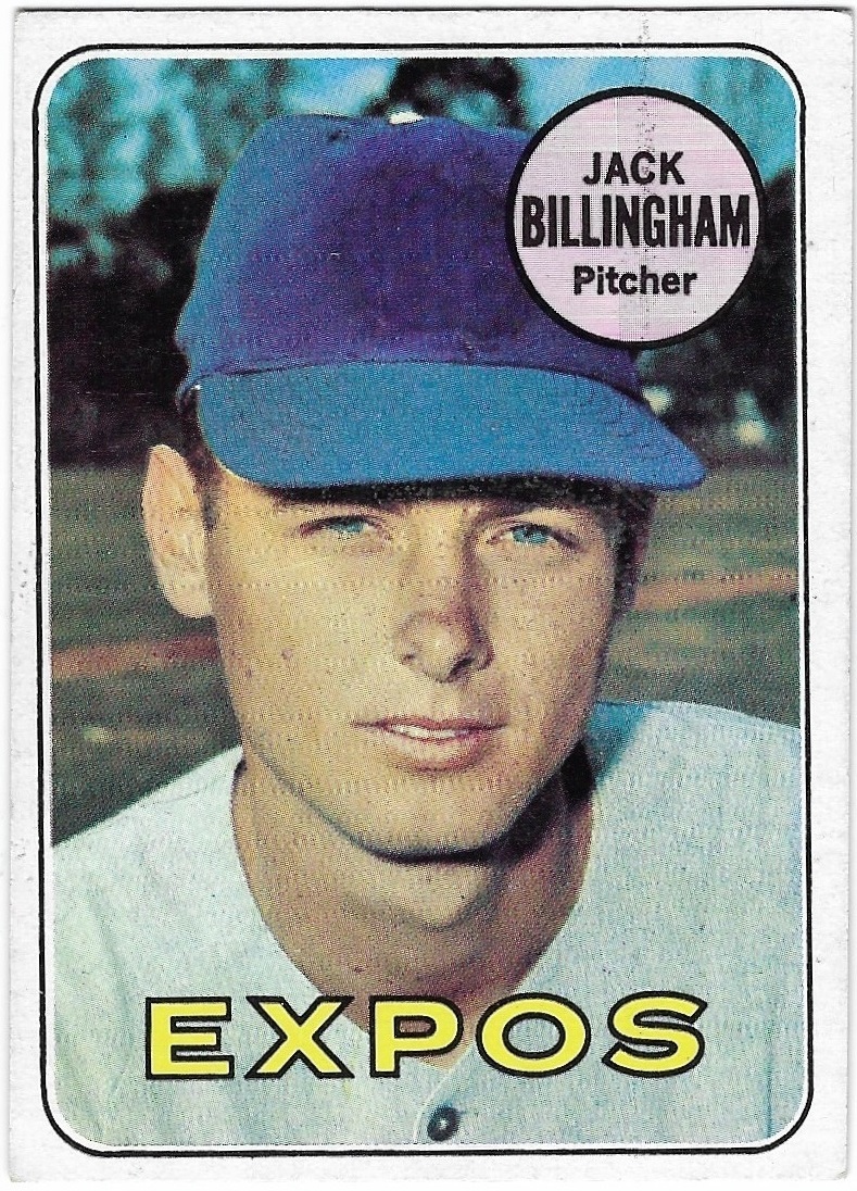
although it was full-on dodger blue.
had i been around then, i imagine i would have been gobsmacked when i opened late series packs and saw the real expos hat and uniform for the first time, like on this mack jones card

or even better, this larry jaster card.

mind blown.
i know that the padres, royals, and pilots (the other 1969 expansion teams) also had cards with their actual uniforms in the late series, but none of those cards (or uniforms) were as strikingly different as those of the expos in my opinion. i mean, just look at this early series rookie stars card

compared to this one from the sixth series

beauty, eh?
with a single release approach in 1977, collectors got an early look at the blue jays' and mariners' logos, but had to suffer horrible airbrushing until the 1978 sets were released. that was not the case in 1969.
side note - when i first saw the expos logo, i thought it said "elb" as in "expos league (?) baseball". not sure when exactly i found out that was wrong. it's a stylized "m", of course, but can also be interpreted as "emb" which stands for "expos (de) montreal baseball".
As someone who collected cards pack-by-pack in 1969, I can say yes, it was very exciting when Topps finally had new photos of these teams (and also the Athletics, who had moved to Oakland the year before),
ReplyDeleteMost interesting were the Expos, and the Pilots with their gold splashes on the caps. Less so were the Royals (whose uniforms were almost identical to the Dodgers), and the Padres, whose uniforms were...brown.
I don't think I figured out that the Expose logo was a fancy M until a few years ago. I probably thought it said elb too.
ReplyDeleteI always thought that logo was "JB"
ReplyDelete