
i mentioned the other day that i picked up some 2024 topps heritage last thursday. after the quick post to share the shortcomings of the fred lynn (and jim rice) baseball flashback card, i am here with some additional th---------squirrel!

this card or sticker, i guess, was in the hanger box i bought at walmart. i didn't really know what it was until i turned it over and saw jeff mcneil's name. i then remembered that these are the zoo's who stickers that represent real life animals used in baseball nicknames.
i later found the cubs' sticker

in a blaster pack. it stinks that there is no bulldog in the set for orel hershiser, but there is a basset hound for fred mcgriff, whose nickname was crime dog. that seems a bit of a stretch to me, since mcgriff's nickname is really a play on mcgruff the crime dog.
ok. first card i saw was this joey meneses offering

which is ok, i guess. the nationals weren't around in 1975 and i know that others with more expertise (e.g. night owl) are addressing the color combinations of these cards, so i won't bother.
i found a few short prints, including nathan eovaldi

and giancarlo stanton

cards. what is with topps' reluctance to put the player's name on the front of these cards? every one of the players featured highlight cards in the 1975 set had at least their last name mentioned. as for the short printing, i suppose topps is trying to make it harder for set collectors to ignore the short prints by putting them at the beginning of the set. i know 2002 topps traded has been cited as an example of this same approach, and it is, but i remember reading back then that it was a mistake and that topps intended for the rookie cards to be short printed and not the veterans. true? who knows.
i did notice right away thanks to orlando arcia's card

as well as corey seager's

that topps isn't trying to replicate the design choices from the original 1975 set. the all-star cards back then used yellow and red.
that's the same color combination that juan soto received

just reversed.
i probably should have scanned kyle gibson's card as a better (or at least more obvious) example, but topps did some (digital) airbrushing just like they did back in 1975, including on jonny deluca's card

it's actually not too bad.
ready for some silliness? 1975 topps does not look good with white borders

even though white borders were the norm in the three years leading up to the design. maybe it's the bright color of the team name on gary sanchez's card that makes it look bad.
here's some more silliness - individual manager cards

not only were there no individual manager cards back in the 1975 set, yogi berra wasn't affiliated with the yankees back then. he began the 1975 season managing the mets, and was included on their team card as their manager. to make things more confusing, berra is included as an oversized boxtopper subject, and he is shown as a met. other headscratchers surrounding these manager cards include dusty baker getting a card, and the embarrassment that is red schoendienst's card.
as for whitey herzog (whom topps thinks looks like schoendienst), he was the skipper of the royals for the latter part of the 1975 season, but it looks like topps couldn't find a color picture of him from his days in kansas city, and put his colorized head and neck on a photo of dick howser or some other team member.
that brings up my biggest issue with this set. it seems like there is some sort of filter or diffuser applied to most of the cards - backgrounds in particular. it also happened the last time we saw the 1975 design with 2019 archives, at least with some of the cards (including catfish hunter's)
miguel amaya looks like he is playing in a low lying fog

but that's not the case

i don't understand why the backgrounds are being filtered like that. one of the only cards i found that didn't seem to have a blurred or diffused background was marco luciano's card

which is actually a bit of a throwback to recent years of heritage with a studio photo presented with a generic spring training field background. so, even that card has a modified background.
here are a couple more giants cards

i scanned them because they give a good view of the vida blue and gaylord perry memorial patches, including their side-by-side display that began after the giants added their advertising patch. both of these cards will go in my memorial patch collection, bumping patrick bailey out.
as annoyed as i was at the backgrounds, i was ecstatic when i found this card in an early pack

that is, until i also pulled a 1959 mvp card that was not a short print or variation. then i went looking and found that topps did not include all of the mvp years from 1975 through 2023, instead choosing a few and also repeating a few from the 1975 set. still, it's nice to see george brett, mike schmidt, and others


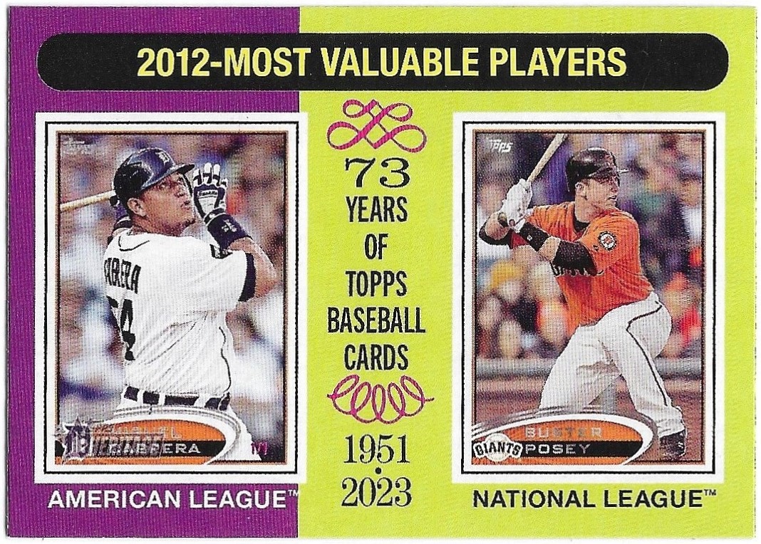


who have won the award over the years since 1975 topps was released. i decided to go ahead and complete the subset, but i'm not as excited about it as i was initially.
it looks like topps did ok with the league leader cards

but the postseason cards? not so much. i don't really care that the nlcs card shows a single player

rather than a play from the series that shows both teams in the field (looks like the alcs also went with the single player approach), but it does bother me that the title of the card is "nl champions" and not "nl championship". but, then again, if they went the single player route than maybe it makes sense to just focus the card title on the winning team. however, the text at the bottom is about a player - not a team or a series - so there is really no way to redeem topps on this one.
i found some of the world series cards, too

the third one there is the series recap, although you wouldn't really know it because topps kept the ball with the "game 5" text as well as the card title the same as the others instead of making a change like they did in '75.
so, it's not perfect which is fine but some of the mistakes are just really, really bad. i hope they get their act together by 2027 when my beloved 1978 design is due to be featured.
i almost forgot about some of the other inserts, like the 1975 baseball sensations


and the required then &now

and new age performers

i really hope to see some dodgers back in the "then" part of those inserts next year. i guess it all depends on the categories topps uses.
one of the things i bought at walmart came with guaranteed blue sparkle chrome parallels, and the guys i got were ha-seong kim

christopher morel

and christian yelich

i also got a news flashback card

of the alaskan pipeline.
as for dodgers, i didn't do too badly, with six of them showing up for me

it's weird to see a dodger card with a designated hitter position. and look at amed rosario! he gets the 1975 all-star color combo, but of course, that same combo was used for some non-all-stars back then as well.
i scanned the backs of the clayton kershaw and gavin lux cards

because in hand they look like they are different colors of card stock. either way, the card backs in this set are super hard to read without a bright light shining on them. coincidentally, both kershaw and lux are the answers to their own cards' trivia question.
i was happy to find the kershaw mvp card

along with a dodger insert thanks to freddie freeman's new age performers card

so that was the stuff i bought at walmart, and between the hanger box and monster box, i only had a couple duplicates.
on saturday, my hobby box was delivered, and i was super excited when i saw the yellow top/red bottom dodger buyback card on top as i was opening the box

and even though it's not steve garvey, getting willie crawford for the collection is not half bad.
Wow, I could've used that buyback in my hobby box as it's one I still need in the buyback quest. ... Eovaldi is not an SP, weirdly he's the only one in the first 100 that is not short-printed (though #407 is an SP).
ReplyDeletecrazy that topps can't even get their short prints right
DeleteTopps not using the uniform '75 All-Star borders might be the most disappointing part of Heritage for me. That's arguably my singly favorite quality of the original '75s.
ReplyDeleteFirst time seeing one of those Zoo's Who inserts or white border variations. Just noticed Catfish Hunter got a card. Hoping to add one of those to my collection at some point.
ReplyDeleteTaking a guess and saying there'll be issues with the 2027 Heritage set too. Seems like a lot of the issues with this set were certainly preventable. Thanks for showing off the cards!
ReplyDeleteTrying to catch up on my reading and in my hasty scrolling thought that I saw Mike Schmidt swinging a hockey stick in the 1980 MVP card
ReplyDelete